Travel technology · hotel inventory and content operations
Property Mapping Report
A reporting interface for checking how completely a hotel inventory maps across suppliers, affiliates, countries and cities — built around data quality rather than data volume.
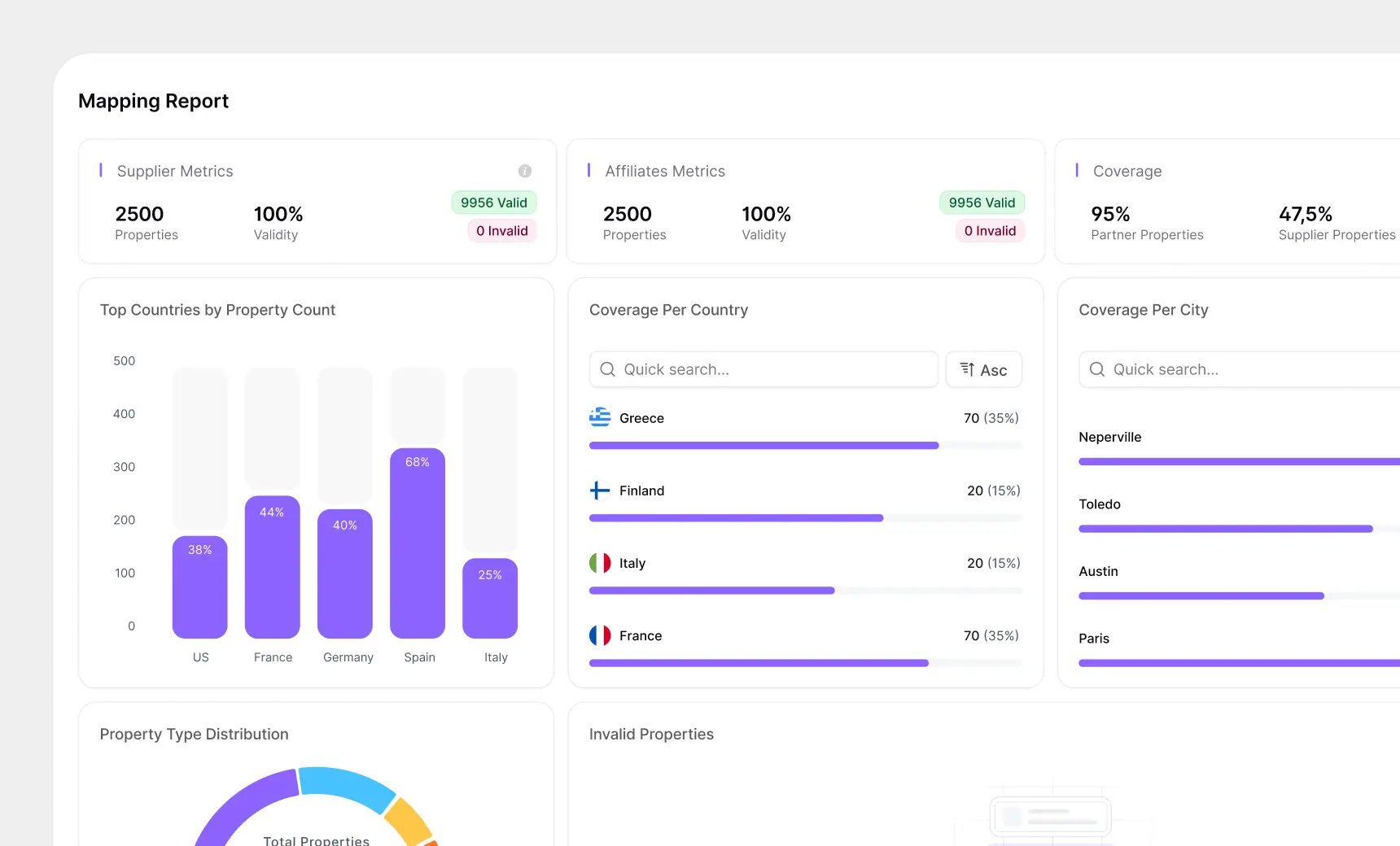
- Validity metrics paired with explicit valid and invalid counts
- Coverage expressed as both an absolute count and a percentage, together
- Searchable, sortable country and city lists for long-tail inspection
The problem
When hotel inventory moves between systems, properties have to be matched to each other. A property known to one supplier has to be recognised as the same property by an affiliate, in a different catalogue, possibly under a different name. That matching is never perfect, and the gaps are expensive: an unmapped property is inventory nobody can sell.
The people who own this problem do not need a dashboard that says coverage is good. They need one that shows them precisely where it is not, at a level of granularity they can act on — which country, which city, which property.
That makes this a different design problem from a performance dashboard. Nobody visits this screen to feel reassured. They visit it to find the broken thing.
Leading with validity, not volume
The top row carries three cards: Supplier Metrics, Affiliates Metrics, and Coverage. The first two are structured identically — property count, validity percentage, and then a pair of pill badges giving the valid and invalid counts as absolute numbers.
Showing 100% validity alongside an explicit "0 Invalid" badge is redundant on a good day, and that redundancy is the point. A percentage on its own hides scale: 99% validity means something very different across two thousand properties than across two million. The badges also give the failure state somewhere to live — the moment invalid is not zero, there is already a component sized and coloured to say so, in red, without the layout shifting.
The Coverage card breaks the pattern deliberately, showing partner properties and supplier properties as two separate percentages. They are different questions and the gap between them, 95% against 47.5%, is itself the finding.
Three views of the same question
Coverage is then shown three ways, because "where are the gaps" is asked at three different altitudes.
Top Countries by Property Count is a bar chart with each bar drawn inside a lighter track representing the total. The filled portion is the mapped share, labelled with its percentage inside the bar. That ghost track is what turns a bar chart into a completeness chart — you are reading the gap as much as the fill, and Spain at 68% next to Italy at 25% needs no legend.
Coverage Per Country and Coverage Per City are lists rather than charts, each with a quick search and an ascending sort. Charts are good for the top five and useless for the long tail, and the long tail is exactly where unmapped inventory hides. Each row pairs a count with a percentage — "70 (35%)" — so neither figure has to be inferred. Country rows carry flags, which makes scanning a long list meaningfully faster than reading names.
Designing the empty state as good news
The Invalid Properties panel is the one place where empty is the desired outcome. Most empty states are apologies — nothing here yet, try adjusting your filters. This one had to read as success without being celebratory, because the same component has to sit calmly next to a populated list the following week.
The resolution was a soft, low-contrast placeholder rather than an illustration or a message in an alert colour. It occupies the space the table would occupy, so the layout is stable whether or not there is anything to show, and it does not draw the eye away from the panels that do have findings in them.
What I would explore next
The strongest addition would be movement over time. Coverage as a single number tells you where you stand; coverage as a trend tells you whether the mapping work is winning, which is the question an operations team actually lives with week to week.
Beyond that, the report currently ends at diagnosis. The natural next step is making a row actionable — going from "Italy is at 25%" to the list of specific unmapped properties behind that number, without leaving the screen.